
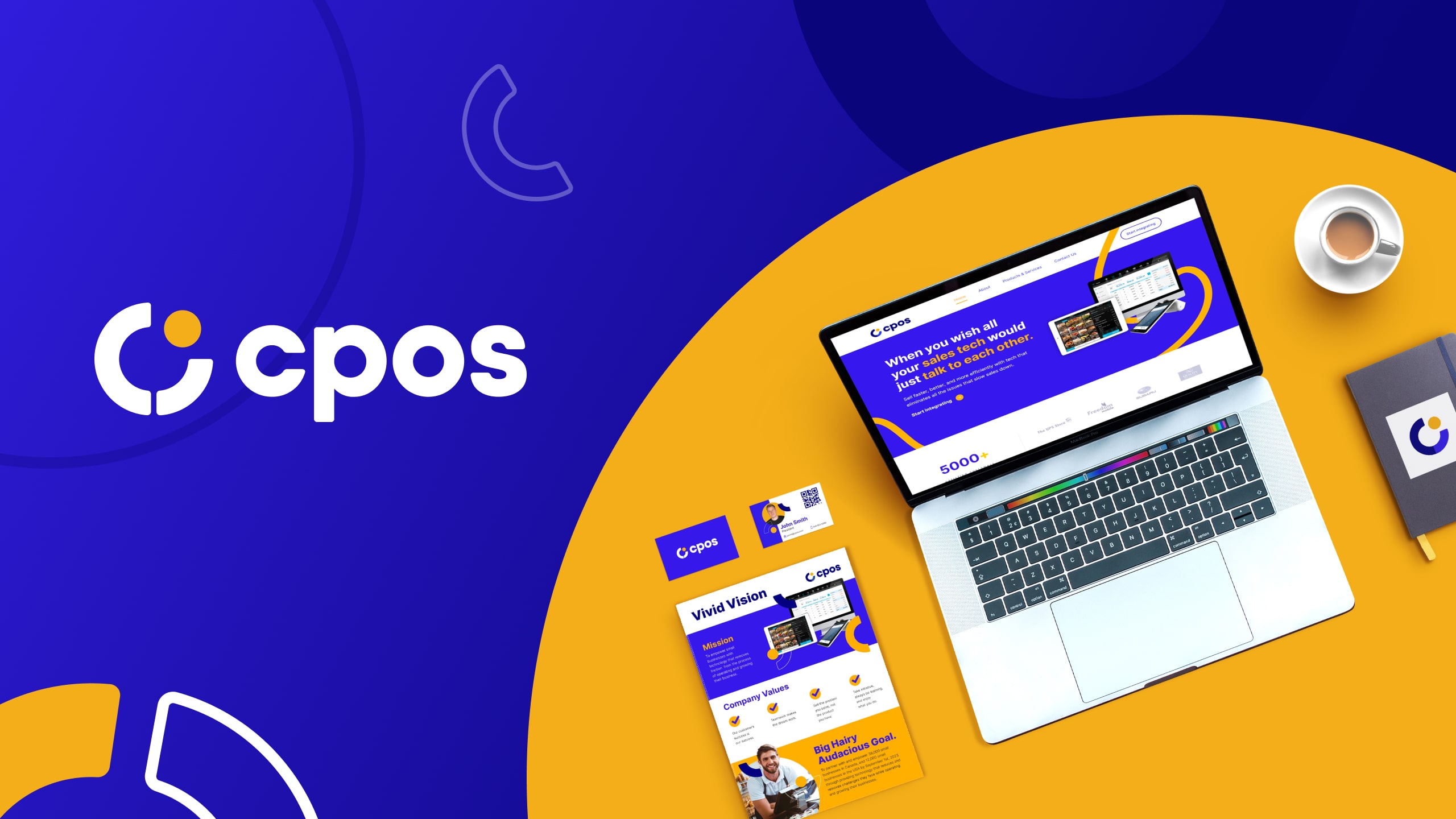
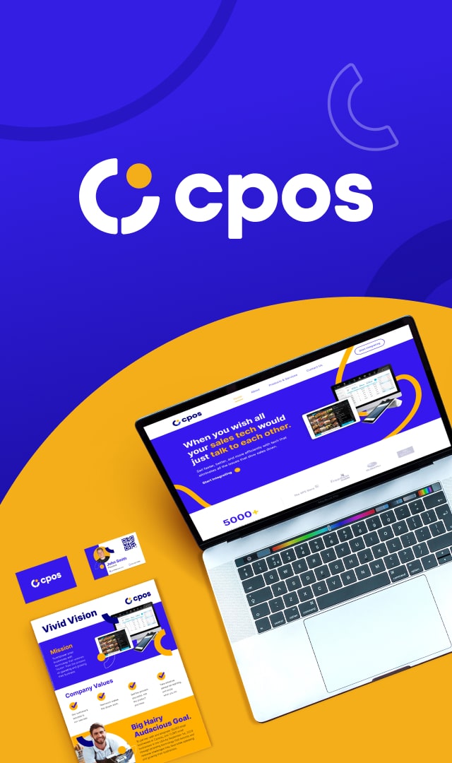
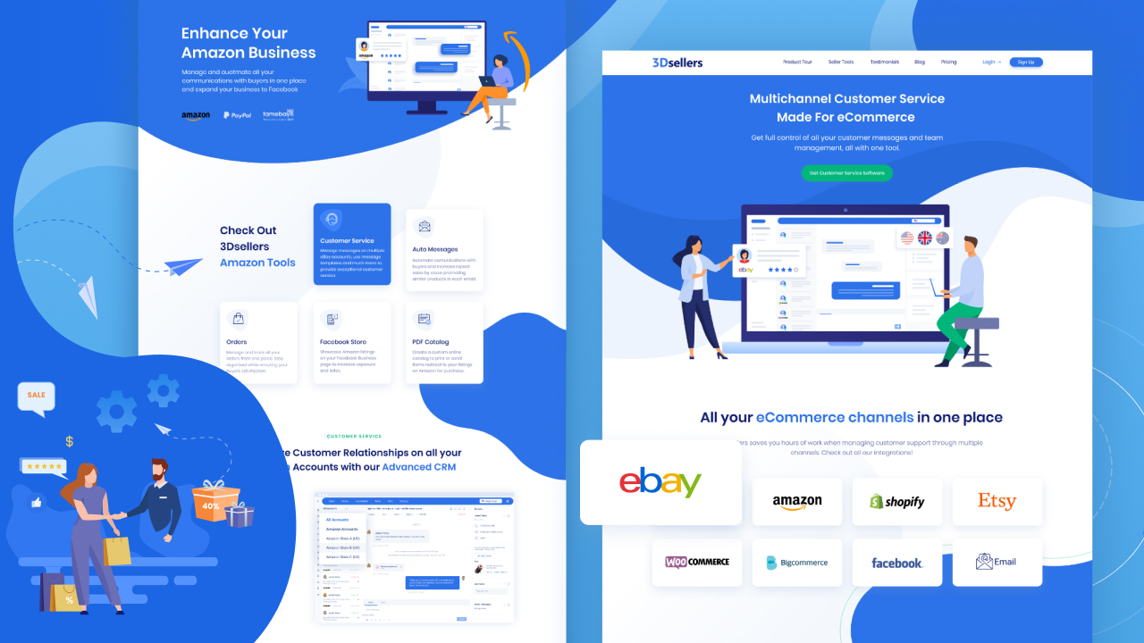
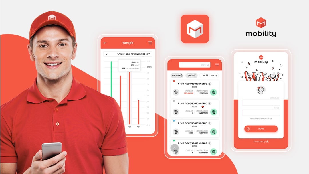
CPOS
The brief
CPOS makes use of automated technologies to help small and medium-sized enterprises optimise their online ordering, point of sale, and payment systems.
It's for businesses that wish their sales technology would ‘just talk to each other’, and it enables those businesses to function more efficiently, develop their business, and compete more successfully in the market.
They entrusted us with creating branding that gave the company a strong identity and symbolised what they stand for and what they offer.
The Challenge
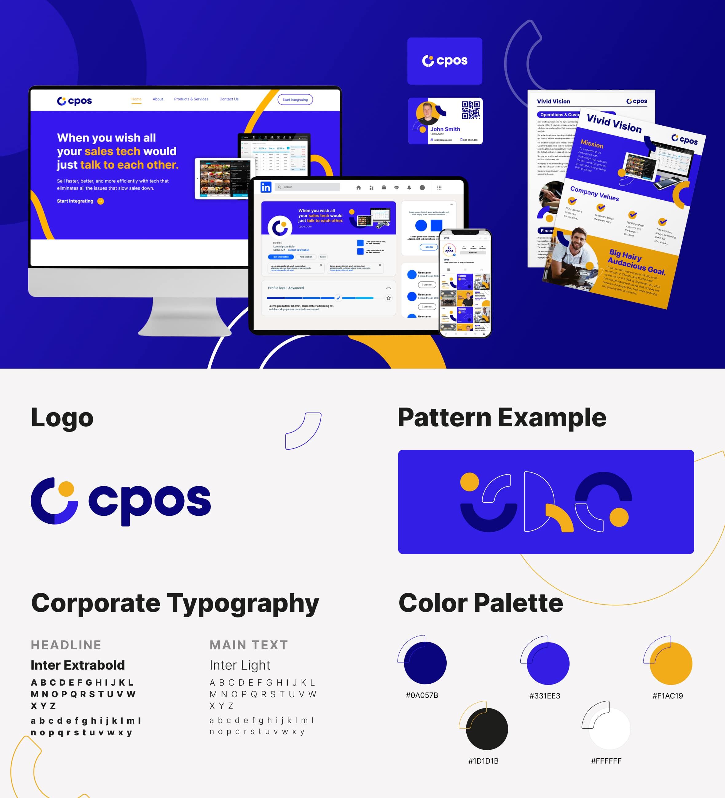
Logos are the foundation of all branding. The CPOS logo represents the importance of seamless integration to CPOS and their customers. A trinity of symbols form a circular motion, demonstrating how CPOS relies greatly on excellent cooperation and collaboration to make the world a better place for small businesses.
The brand’s personality is both positive and inclusive. Their core values explain how CPOS achieve their goals by being open-minded and innovative.
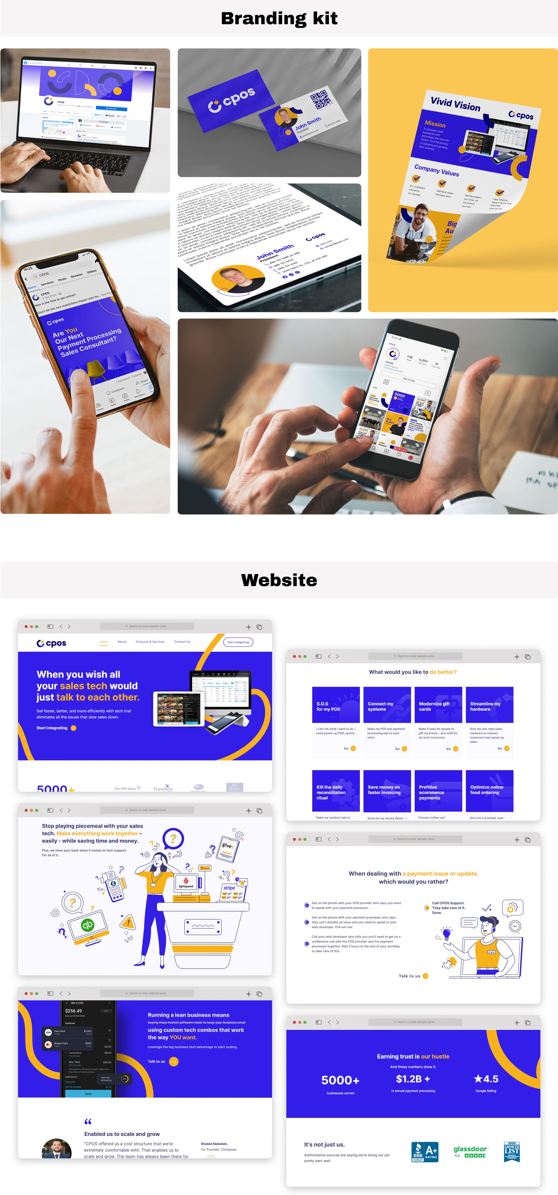
The Solution
We picked a distinct colour palette of blues, yellow, black, and white, as well as typography that was meticulously constructed and designed for computer displays, to create a clean, eye-catching design and an easy-to-navigate website.
The whole appearance instils confidence in clients that this business is taking significant measures to build technology that allows for fair competition with corporate giants, and for small to medium enterprises to thrive and prosper.


Let’s chat…


