
Is minimalistic design here to stay?
You’ve probably heard of Helvetica – one of the most famous typefaces in the world. It has been used everywhere - from subway navigation to appliance and car manufacturers’ logos. They even made a movie about it.
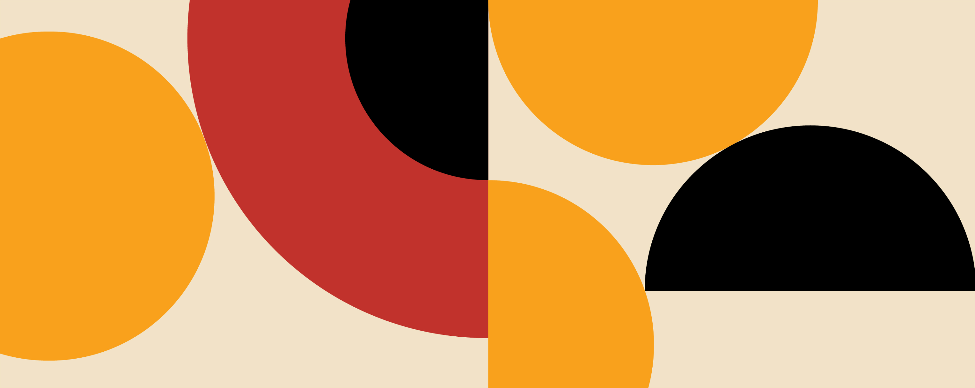
Helvetica was created more than half a century ago and yet it still feels timeless and contemporary today. Why? Because it’s a minimalistic font. Minimalism has been around for quite a while, though it went through a decline in popularity, but is now firmly back in fashion.
Today, Silicon Valley corporations are major aesthetic trendsetters. Let me guess. You probably found this article via Google. Possibly on an Apple laptop? A closer look at the logo evolution of large corporations can tell us a lot about current trends in visual languages.
During the course of the last two decades, Google’s logo turned from bright and weird to calm, with big, flat, stark lettering. Apple’s apple dropped its color and became black. Many other corporations are also turning towards minimalism with updates to their visual languages.
One of the reasons for this is an ongoing battle for customer attention. Attention spans are shorter and there are just too many visual distractions around. No one wants to waste their time trying to decipher an obscure, complex visual marketing campaign.
If a message isn’t immediately clear, it will get ignored. Your marketing campaign has to be concise, deliver its message straight and cut out everything that is unnecessary. This is where minimalism delivers. Boldness and thought-out simplicity are perfect tools to cut through the noise.
There is a fine line to tread. Following rules and excessive austerity could turn your brand into another boring gray clone. You must keep oddness, playfulness and quirkiness in mind and try to address unique features that define your brand’s identity. You must keep your customers surprised to increase conversion.
Luckily, a minimalistic approach to design comes in handy, as it’s never too visually cluttered and there’s always room to add the cherry on the top that in the end makes or breaks everything.
This flexibility is another reason why minimalism is an exceptional tool. It can, and should, be mixed and matched with other visual languages. Think outside the box – what if what you need to make your next campaign successful is minimalism blended with 80s video game aesthetics?
Strong brand personality and a distinct visual language to match are of the utmost importance for any business. There’s a reason why large corporations update their logos every couple of years. It’s a huge investment, but it keeps the brand fresh and conversion steady.
There’s still room for exploration within minimalism and opportunities that are waiting to be tapped into and utilized. Sleek, bold and clean designs are here to stay, so don’t hesitate.


